Your website is making a
first impression right now.

When someone Googles your business, they judge you in under 3 seconds. A site that looks like it was built in 2009 — and hasn't been touched since, tells potential customers that you dont care about having a nice website. Can't be bothered. This might make them question your businesss.

See what it costs to fix it
94%
of first impressions are design-related
3 sec
before a visitor decides to stay or leave
75%
judge credibility by website design alone
5–10 yrs
how long most small biz sites go untouched

You take pride in your business.
Does your website show it?

You've poured years into your craft, your space, your staff, your reputation. A website that looks like a relic of the early internet undermines all of it.

Credibility on the line

75% of consumers judge a business's trustworthiness by its website design. An outdated site doesn't just look bad — it actively loses you customers who never even pick up the phone.

Half your traffic is mobile

Sites built pre-2015 were never designed for smartphones. If your site pinches and zooms on a phone, you're already asking visitors to work harder than they're willing to.

A small investment, real returns

If a better-looking site converts even one extra customer a month — one dinner reservation, one job booked, one consultation — it pays for itself. Many businesses see that in the first week.

Dillon's Local — Plymouth, MA

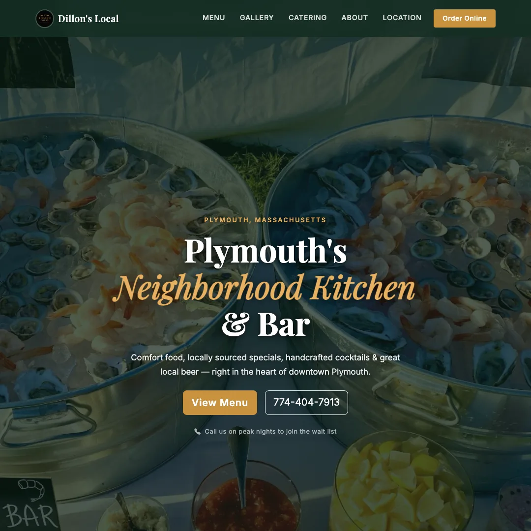
A beloved local bar with great regulars, awesome food and drink, live music, and a real community following. The website looks like a Myspace page that got lost on the way to 2024. Hard to read, harder to navigate, impossible on mobile.

Before
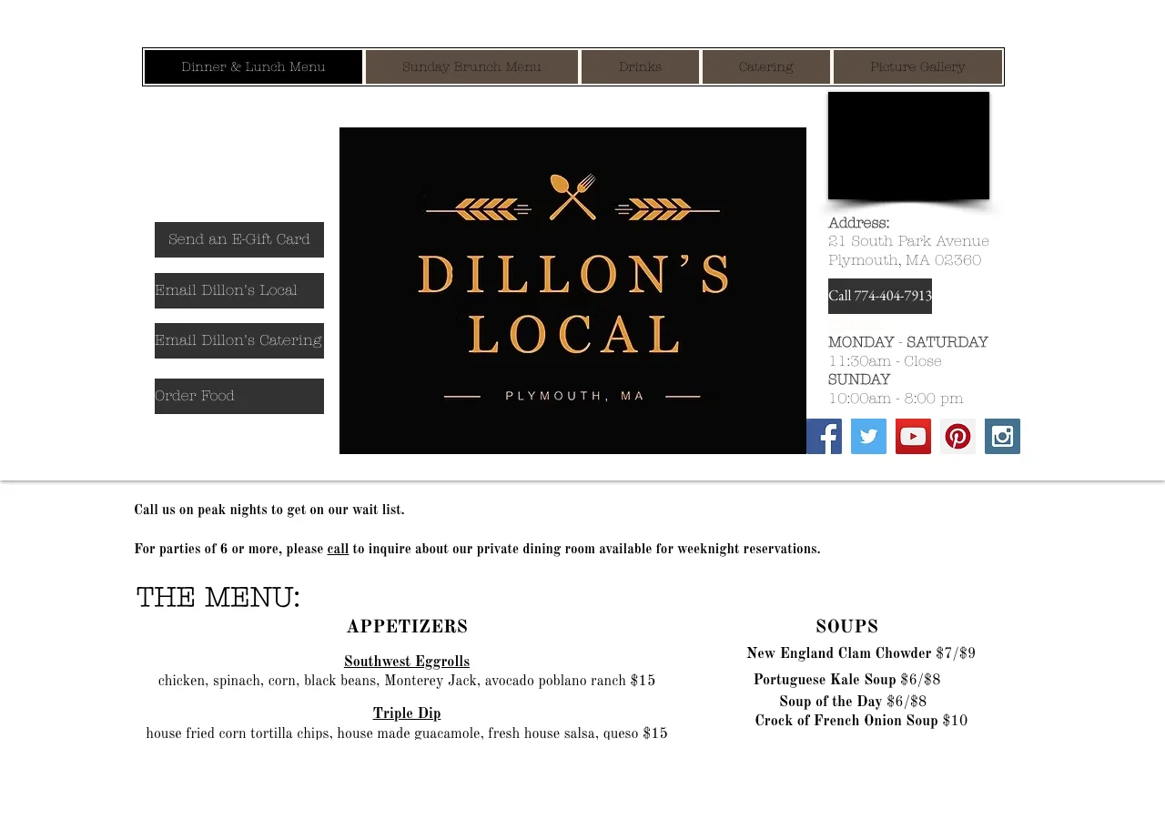
Dillon's Local — old website
The old site

Cluttered layout, impossible to read color contrast, no mobile support, and a design vocabulary last updated circa 2010. First-time visitors had no idea what the place was.

No mobile support Poor readability Outdated design
After
Dillon's Local — new Wicked Fast site
The new site

Clean, bold, and instantly readable. The vibe of the bar / restaurant comes through in seconds. Fully responsive, fast-loading, and designed to make someone walk through the door.

Mobile-first Clear hierarchy On-brand feel
View the new site

John L. Sullivan Law — Boston, MA

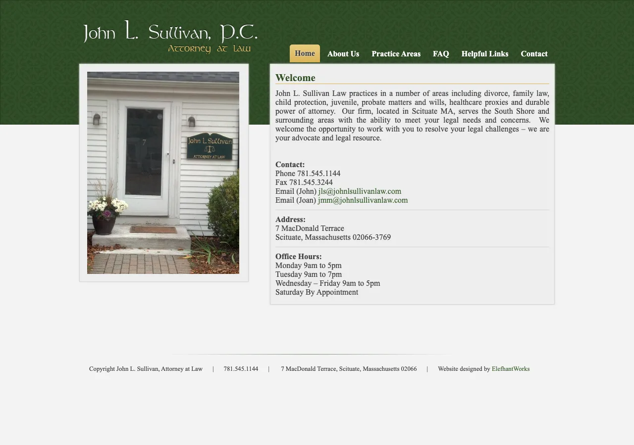
An experienced attorney who wins cases. His old site, however, looked like it hadn't been touched since the Clinton administration — clip art, Times New Roman, and a layout that screamed "I don't trust technology." For a profession built on credibility, that's a real problem.

Before
John L. Sullivan Law — old website
The old site

Cramped text, clipart graphics, a design that undercuts decades of legal experience. When you're choosing a lawyer, trust matters — and this site worked against it.

Looks amateur Undermines credibility Not mobile-ready
After
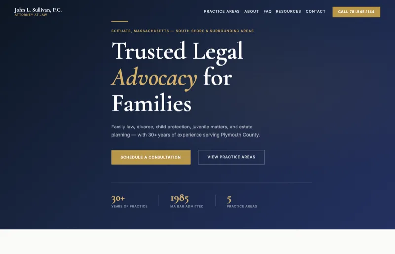
John L. Sullivan Law — new Wicked Fast site
The new site

Authoritative, clean, and instantly professional. The kind of site that makes someone say "this is who I want representing me."

Builds trust Clear calls to action Looks the part
View the new site
"If someone drives past your storefront and it looks neglected — peeling paint, flickering sign, dirty windows — they keep driving. Your website is your digital storefront. It's open 24 hours a day, and it's the first thing people see before they ever meet you."

Warren Tavern — Charlestown, MA

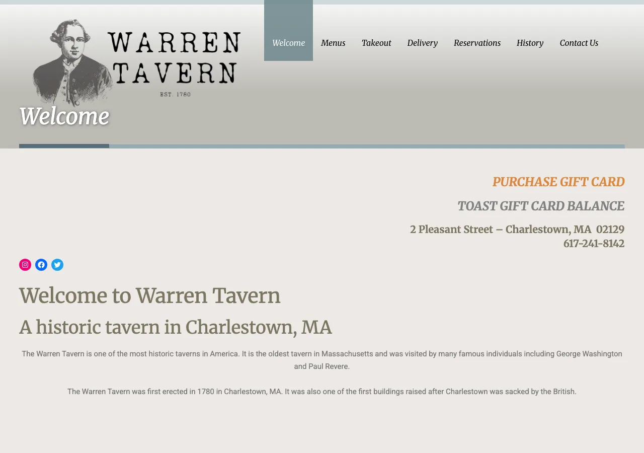
One of Boston's oldest and most storied bars — George Washington drank here. The old website did absolutely nothing to convey that history, that atmosphere, or that neighborhood pride.

Before
Warren Tavern — old website
The old site

Generic, forgettable, and completely misses the chance to tell one of Boston's best stories. No atmosphere, no hook, no reason to visit.

No story or character Generic layout Misses the brand
After
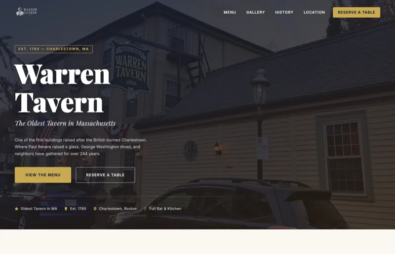
Warren Tavern — new Wicked Fast site
The new site

Rich, atmospheric, and dripping with Charlestown history. The new site makes you want to walk in and order a pint before you even finish scrolling.

Tells the story Atmospheric & inviting Drives foot traffic
View the new site

Armstrong Fence — Massachusetts

A respected local fence company with decades of work in the ground across Massachusetts. Their old site looked older than most of the fences they've installed — and gave prospective customers no confidence in calling.

Before
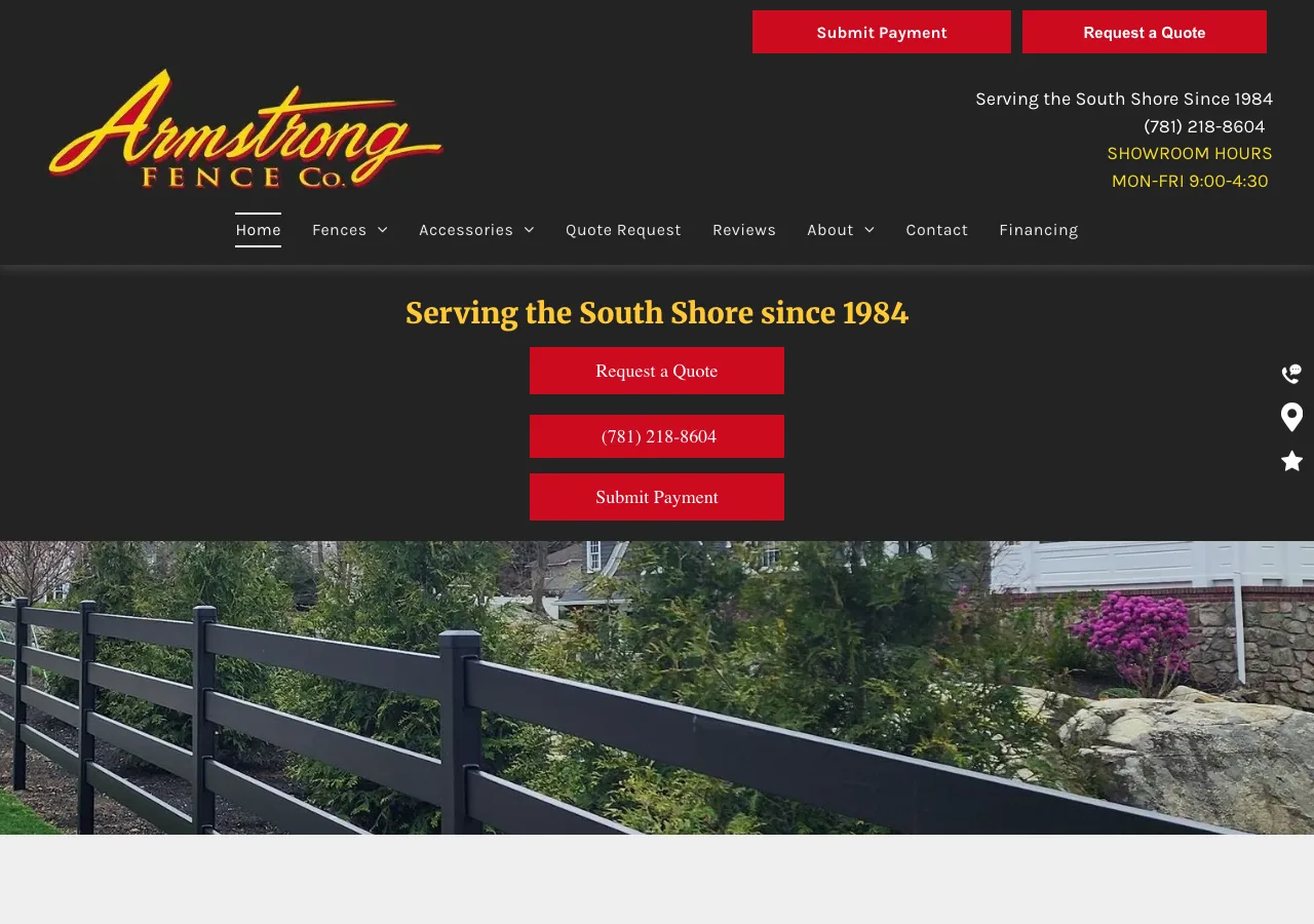
Armstrong Fence — old website
The old site

Outdated layout, weak photography, and nothing to communicate the quality of their craftsmanship. Competitors with worse work but better websites win the click.

Weak photography No trust signals Looks dated
After
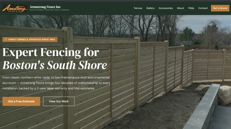
Armstrong Fence — new Wicked Fast site
The new site

Clean, confident, and built to show off the work. Gallery-forward layout, clear contact prompts, and a design that matches the quality of what they actually build.

Showcases the work Easy to get a quote Looks professional
View the new site

See what your site could look like.

I'll build a complete redesign of your site — no charge, no commitment. If you love it, we go from there. You WILL get more business.

View Pricing & Get Started

No contracts. No upfront cost for the preview.